Taking ADvantage
Ads We Could Probably Do Without
Compiled by
Richard F. Taflinger
PARENTAL WARNING: You may find some of these images less than
acceptable for viewing by your children. I suggest explaining to them why
they're wrong.
This
page has been accessed since
28 May 1996.
These are ads from a variety of places, found
by my students or myself. I've included a little commentary with each.

Notice how difficult it is to figure out what the product is. But then, the
visual should stop a reader in rher tracks and hold rher attention for awhile
-- maybe long enough to locate the sponsor.

The stereotypical dumb blonde. In fact, this one is so
dumb she can't even spell correctly when she speaks! What does she have to do
with foam insulation? Absolutely nothing! She's simply there to stop the reader
in his tracks, and perhaps wonder at the double entendre. A
prime example of sexist advertising. DON'T DO THIS!!!

Another prime example of sexist advertising. Don't you
just love the subtlty of the double entendre?

To hell with a subtle appeal to sex -- let's toss in a little bondage!

In most clothing ads, there is at least a suggestion of cloth. Perhaps the felt
is sufficient. At least the reader will stop and ogle (or is that goggle?) long
enough for the product name to sink in.
 At
least the Versace name is obvious. One is not entirely certain what this is an
ad for (the logo is in the upper left corner (yes, that little white blotch)),
or even if it's an ad at all.

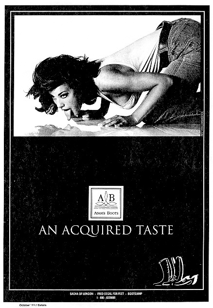
This one should get a little attention, don't you think? There's nothing like
having a beautiful woman licking one's boots to raise one's sense of the
intrinsic worth of women -- and of course sell the boots that would cause such
a reaction in women. N'est-ce pas?

Lest you begin to think that only women are demeaned in using sex in
advertising, there is a school of advertising that says men's bodies, brains
and self-esteem are legitimate targets to attack, exploit and belittle (no pun
intended).
Return to Taking ADvantage Contents Page
Return to Richard Taflinger's Home Page
You can reach me by e-mail
at: richt@turbonet.com